Are you looking to have a website that drives success for your business? Then make sure your Web Design is Responsive.
What is Responsive Web Design, but? In simple words, it is a website built to be friendly across various devices. A website is the most critical aspect of your online presence. So what is the aim of responsive design? – To build web pages that can identify the visitor’s screen size and orientation. And change the layout accordingly.
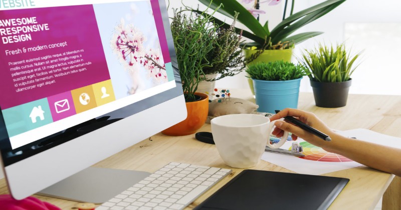
This is How Responsive Web Design Look like
Do you know why your business needs to have a responsive website? Find out below:
5 Factors that highlight the importance of Responsive Web Design
1.Traffic from Mobile Users:
More and more, people are browsing the Web on their phones. In 2020 the number of mobile users are 3.5 Billions. In 2021 the number will increase upto 3.8 Billions.
Mobile users number
You can see in below infographic, how much it is necessary to concentrate on mobile in Marketing Strategy
Mobile and Smartphone Statistics
These statistics define the importance of a mobile-friendly website. If a website not well optimized for mobile devices is losing more than half of its traffic. Google ranks websites that are not responsive lower in its search. So what to do to build the Website for your audience on various devices? – Make it Responsive. It will make your audience stay on the site longer.
2.Google Recommended
Sites that use Responsive Designs are search engine friendly. From 2015, Google rewarded sites optimized for mobile platforms. Many businesses started taking mobile websites seriously.
But since 2018, Google began its Mobile-first indexing strategy. Google at present primarily crawl, index and rank the mobile version of the Website. It is to help mobile users find what they are looking for. Responsive Web improves SEO overall.
3.Economical and easy to maintain a Website
If you make two versions of the Website, for desktop and mobile, it is expensive. Making one responsive Website is always less time-consuming. Plus maintaining two sites is a tedious process. It requires additional testing, support and two teams. Responsive Web Design’s one size fits all way helps save time, money and efforts.
4.Reduce Bounce Rates
If your Website is not optimized for all the devices, it will also take more time to load and navigate. The mobile audience particularly has a lesser attention span. They will leave your site if it takes longer time to load. In contrast, a web design made for both desktop and mobiles will load faster. It ensures users stay longer on your web pages. And it may convert your users into a lead too!
5.User Experience
No one likes a website which needs to scroll horizontally. It is irritating!
A responsive website adapts easily to any screen size. It avoids distortion of texts and images. Your Website automatically adjusts to suit mobile, desktop, tablets, smartwatch, any IoT device.
Now you know how important it is to have a Responsive Website. Your next question is obvious –
How can you make your Website Responsive?
1.Design the Website for Mobile First.
It is one of the popular approaches to design a responsive website. As seen earlier, the most traffic coming to sites is from mobiles. Design your mobile Website first and optimize it for the other devices. Build your site with the smallest screen. Once you set up a small screen layout, slowly scale your screen size larger.
2.Scalable Vector Graphics (SVGs)
What is SVGs? Is this term new to you? Let me explain. In simple words, SVG is an image format for graphics on your site. SVGs support interactivity and animation. As you agree, images are essential on the Website. Using high-resolution images does not serve the purpose. You’ll need varying sizes of images and icons on different devices. SVGs are necessary to maintain the quality of images/icons/graphics irrespective of the devices. Also, most of the browsers support SVGs; it is the preferred file format.
Look at the difference between bitmap and vector image:
Why Vector Image is Necessary
3. Making Videos Responsive
These days Video or two is predominantly present on websites. You can learn more about the importance of videos on our blog
As Video Content is vital in marketing, it needs to be responsive. The Video should expand or shrink according to the size of a device without changing the aspect ratio.
How do we see videos on different devices
4.Minimalist Approach
Do more with less. You will have to make the interface simple and remove unnecessary elements. The art of less is getting more popular. And it is going to stay. Minimalism retains a clean and organized look for your Website. Some of the points to consider:
- User-friendly interface
- No extra buttons
- Limited colour usage
- Large Background images/ videos 1.
5.Hidden Menu
It is a practice of revealing the menu when you interact with the Website. It avoids cluttering your site.
Below are the points you need to remember for Responsive web Design Development
- Large Clickable areas for Buttons and Links
- Font and sizes of typography: Say No to fancy fonts. Use the right colour for the text, which is in contrast with the overall background. Use font size appropriate for mobiles and desktops
- Put important information near the top on mobile.
- Easy navigation
- Put shorter forms
- Test and Retest: Perform cross-browser testing timely
Do keep in mind Mistakes you don’t want to make for your Responsive Website
- Delayed loading
- Cluttered Home Page
- Only Thinking about Small Screens giving less attention to Large Screens
- Placing buttons too close (This causes clicking on the wrong button by mistake )
- Unnecessary pop-ups
- Missing Strategic Content: Now that you have a good looking responsive website, do not neglect the quality of content. A successful website has excellent content and appearance.
Responsive Web Design is famous. Companies like you are looking for making Website responsive. Some of the organizations, who do not have Website, are happy to create responsive Website. Everyone wants the Website technically sound and giving insightful content.
Fiviza is a team of workaholic professionals. We have built Responsive Websites for small, medium and large scale industries. We have worked for various domains to convert non-responsive Website into Responsive ones.